TINYpulse Brand Book
Problem:
TINYpulse, is a SAS company that makes employee engagement software for HR professionals. And while they were one of the first companies in their field, after 6 years they still didn’t have a defined set of brand guidelines. TINYpulse has grown, both in size as a company and in breadth of product offering, but has no consistent identity to share with clients, and employees.
Solution:
Create a strict set of brand guidelines to be used within marketing and product design.
The Brand Book sections include: Logo System, Color System, Typography, Iconography, Illustrative Approach, Photography, Visual Elements, Print Collateral, Blog Template Designs, Pendo Notification Templates, Copy Guidelines. Brand book includes design guidelines and content guidelines.


Check out the full brand book here (including all copy and content guidelines)!

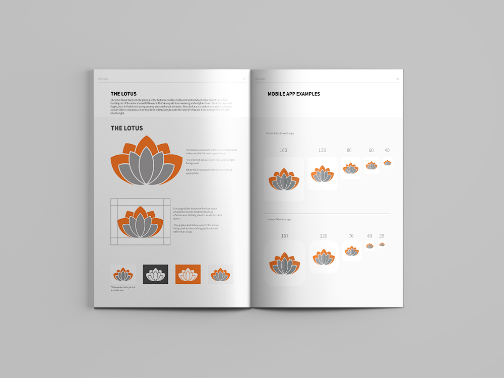
The Logo
While TINYpulse had a unique logo and name already, there were no rules on how to use this logotype and combination mark appropriately.
What I Did:
Kerned and updated the logo for more appropriate visual usage, and created a set of guidelines on how to use and how not to use both the combination mark and the lotus logo as separate entities. I also created a logo designed for web and print at small sizes.
Typography
TINYpulse was using 3 fonts within product, and many others within the Marketing collateral, as well as numerous sizes, and weights. To be more consistent we decided to choose just one primary font and use secondary fonts only within marketing materials. One of the constraints of choosing a primary font was that we needed to use a free font. We ended up choosing to go with Source Sans Pro as a primary font, but still needed to know how to use the font within web design.
What I Did:
Chose the primary font, based on research and cost/benefits analysis. I then created the outline for how to best use the font for web and print materials.

Color Guidelines
TINYpulse had a brand orange color, but no other specified colors.
What I Did:
Created a set of colors and gradients to be used within Product and Marketing materials. I also specified specific colors to be used within illustrations.


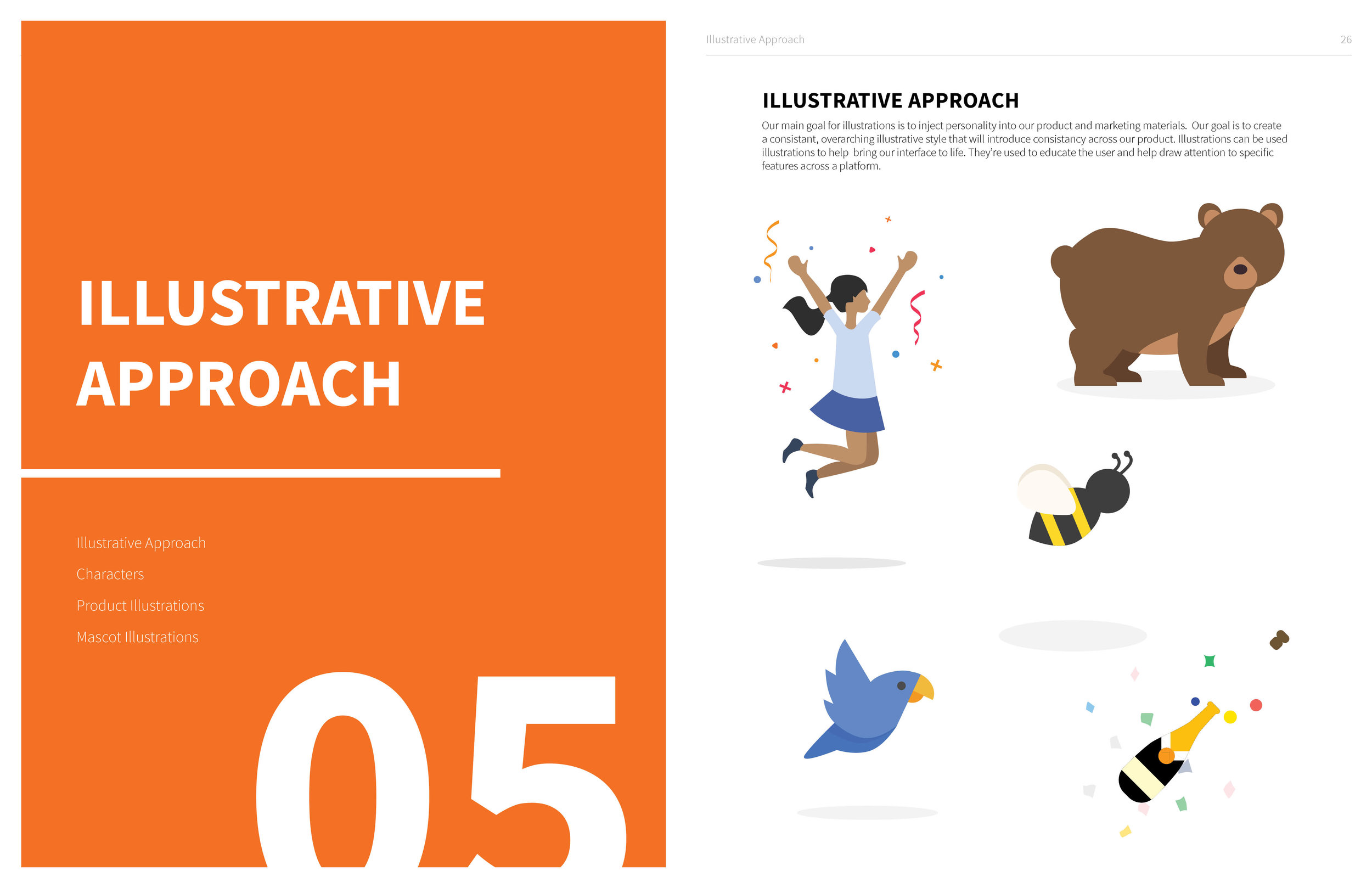
Illustration Style
TINYpulse had many different illustration styles in the past. I took the opportunity to finalize and clarify a single illustration style.
What I Did:
Worked with fellow designer Camila Garcia Castillo, to create a single illustration style for our company to use for both Marketing collateral and in product notifications. The main goal of this style is to help inject personality into our materials. These illustrations help bring the product interface to life.


What I Did:
Wrote and created all designs and materials for Brand Guidelines. Worked closely with Marketing, and Leadership on creating and approving Brand Guidelines for entire company.
Brand Copy Guidelines, layout done by me, but written and curated by Estelle Pin, Content Marketing Manager, and Sarah Ruscoe, Content Marketing Specialist.